Template Style Guide
Version 1.0
Here's a complete styleguide based on Framepad for easy customization. Visit https://www.framepad.co/ for documentation on using Framepad Starter & the style guide effectively.
Customize Global Styles
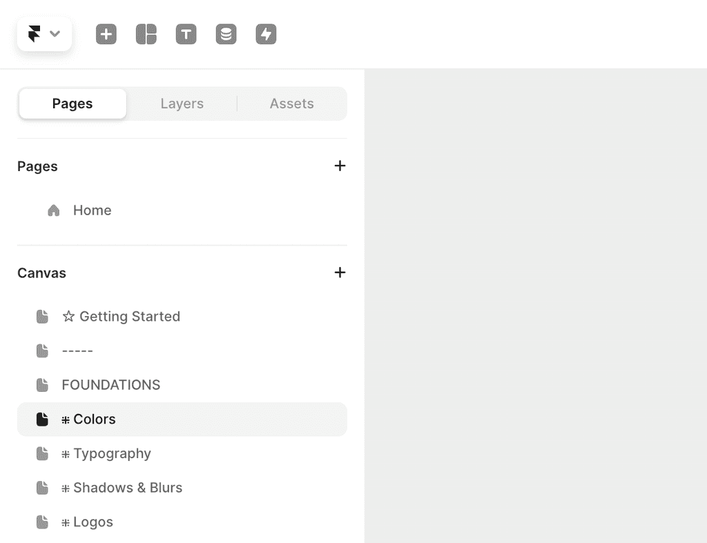
Colors
The first thing you can do to start using Framepad is by customizing the colors. All Framepad components and sections are connected to color styles, so changes will apply everywhere.
Everything is grey
Everything is pretty grey isn't it. That's on purpose though. Framepad is designed to be as flexible as possible and fit any brand, which is why we opted to keep the primary color grey. Adding color is super easy though.
Head to the Colors page. There you can change the Primary color to your brand color and create secondary colors if needed. There's detailed instructions over there.
Typography
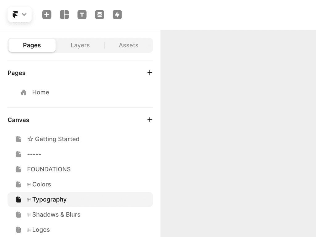
After you've customized your colors, you can move onto the typography. Again, any changes made to the typography styles will be reflected in every component and section in the kit.
By default, Framepad is using Inter by Rasmus Andersson. However you can easily change this to any font family you like.
Head to the Typography page to view and edit all typography styles, from heading, body and detail styles.
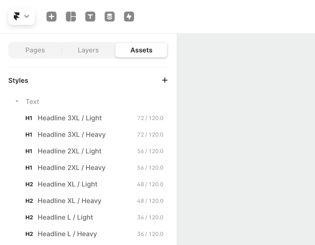
Assets Panel
You can easily view and edit all styles from the Assets panel. By clicking the Assets toggle and scrolling down to Styles, you'll see a list of typography and colors. Here you can click on any style to edit them.
By default, Framepad is using Inter by Rasmus Andersson. However you can easily change this to any font family you like.
Head to the Typography page to view and edit all typography styles, from heading, body and detail styles.
Logo
Open the 'Your Logo' component and replace with your logo. It will apply on all components that show your logo (navbar, footer etc)
Logo placeholders
Buttons
Solid
Primary button usually reserved for the main action
Outline
Usually used to indicate a secondary action, although can act as a primary button if the solid button isn't used in the design
Ghost
A more subtle button reserved for less important actions
Link
Minimal button with no padding. Often used for less important actions and back buttons
Badges
Primary
Sq / L / Default
Label
Sq / S / Default
Label
Sq / L / Dot
Label
Sq / S / Dot
Label
Sq / L / Icon
Label
Sq / S / Icon
Label
Rd / L / Default
Label
Rd / S / Default
Label
Rd / L / Dot
Label
Rd / S / Dot
Label
Rd / L / Icon
Label
Rd / S / Icon
Label
Minimal
Sq / L / Default
Label
Sq / S / Default
Label
Sq / L / Dot
Label
Sq / S / Dot
Label
Sq / L / Icon
Label
Sq / S / Icon
Label
Rd / L / Default
Label
Rd / S / Default
Label
Rd / L / Dot
Label
Rd / S / Dot
Label
Rd / L / Icon
Label
Rd / S / Icon
Label
Default
Sq / L / Default
Label
Sq / S / Default
Label
Sq / L / Dot
Label
Sq / S / Dot
Label
Sq / L / Icon
Label
Sq / S / Icon
Label
Rd / L / Default
Label
Rd / S / Default
Label
Rd / L / Dot
Label
Rd / S / Dot
Label
Rd / L / Icon
Label
Rd / S / Icon
Label
Grey
Sq / L / Default
Label
Sq / S / Default
Label
Sq / L / Dot
Label
Sq / S / Dot
Label
Sq / L / Icon
Label
Sq / S / Icon
Label
Rd / L / Default
Label
Rd / S / Default
Label
Rd / L / Dot
Label
Rd / S / Dot
Label
Rd / L / Icon
Label
Rd / S / Icon
Label
Success
Sq / L / Default
Label
Sq / S / Default
Label
Sq / L / Dot
Label
Sq / S / Dot
Label
Sq / L / Icon
Label
Sq / S / Icon
Label
Rd / L / Default
Label
Rd / S / Default
Label
Rd / L / Dot
Label
Rd / S / Dot
Label
Rd / L / Icon
Label
Rd / S / Icon
Label
Warning
Sq / L / Default
Label
Sq / S / Default
Label
Sq / L / Dot
Label
Sq / S / Dot
Label
Sq / L / Icon
Label
Sq / S / Icon
Label
Rd / L / Default
Label
Rd / S / Default
Label
Rd / L / Dot
Label
Rd / S / Dot
Label
Rd / L / Icon
Label
Rd / S / Icon
Label
Danger
Sq / L / Default
Label
Sq / S / Default
Label
Sq / L / Dot
Label
Sq / S / Dot
Label
Sq / L / Icon
Label
Sq / S / Icon
Label
Rd / L / Default
Label
Rd / S / Default
Label
Rd / L / Dot
Label
Rd / S / Dot
Label
Rd / L / Icon
Label
Rd / S / Icon
Label
Gradient
Sq / L / Default
Label
Sq / S / Default
Label
Sq / L / Dot
Label
Sq / S / Dot
Label
Sq / L / Icon
Label
Sq / S / Icon
Label
Rd / L / Default
Label
Rd / S / Default
Label
Rd / L / Dot
Label
Rd / S / Dot
Label
Rd / L / Icon
Label
Rd / S / Icon
Label
Chips
Primary
L - Detail
S - Detail
Minimal
L - Detail
S - Detail
Default
L - Detail
S - Detail
Grey
L - Detail
S - Detail
Success
L - Detail
S - Detail
Warning
L - Detail
S - Detail
Danger
L - Detail
S - Detail
Gradient
L - Detail
S - Detail
Tabs
Pill Tabs
Simple tabs with a background fill on the active tab. Icon can be hidden.
Square
Label
Label
Label
Round
Label
Label
Label
Segmented Control
Segmented Control is similar to pill tabs, however each segment tab sits within a container, and animates to the selected tab. Icon can be hidden.
When adding more tabs, you need to duplicate both the Segment Tab component and the Tab BG item
Square
Label
Label
Label
Round
Label
Label
Label
Underline Tabs
Simple tabs with an underline highlighting the active tab. Icon can be hidden.
Default
Label
Label
Label
Toggles
L / Inactive
L / Active
S / Inactive
S / Active
Accordings
Style 1
Accordion with a decorative icon and chevron icon on the right to indicate open/closed state.
Closed
Accordion Title
Lorem ipsum dolor sit amet, consectetur adipiscing elit. Nullam volutpat nisi sed elit volutpat, et consequat odio porta. In hac habitasse platea dictumst.
Open
Accordion Title
Lorem ipsum dolor sit amet, consectetur adipiscing elit. Nullam volutpat nisi sed elit volutpat, et consequat odio porta. In hac habitasse platea dictumst.
Style 2
Accordion with a plus icon on the left to indicate open/closed state.
Closed
Question text
Open
Question text
Toasts
Snak Bars
Avatars
Image
Avatar with an image
L / Default

M / Default
S / Default
L / Status
M / Status
S / Status
Text
Avatar with the initial of a name
L / Default
FP
M / Default
FP
S / Default
FP
L / Status
FP
M / Status
FP
S / Status
FP
Avatar groups
Image
M / Default


S / Default
M / More Users
+5
S / More Users
+5
Text
M / Default
NA
TI
SK
AE
EC
S / Default
NA
TI
SK
AE
EC
M / More Users
NA
TI
SK
AE
EC
+5
S / More Users
NA
TI
SK
AE
EC
+5
Breadcrumbs
Tooltips
Pointer / None
Tooltip title
Pointer / L
Tooltip title
Pointer / R
Tooltip title
Pointer / BL
Tooltip title
Pointer / BM
Tooltip title
Pointer / BR
Tooltip title
Pointer / TL
Tooltip title
Pointer / TM
Tooltip title
Pointer / TR
Tooltip title
Inputs
Style 1
L / Default
Supplementary text goes here
S / Default
Supplementary text goes here
L / Docked
Supplementary text goes here
S / Docked
Supplementary text goes here
Style 2
L / Default
Supplementary text goes here
S / Default
Supplementary text goes here
L / Docked
Supplementary text goes here
S / Docked
Supplementary text goes here
Ratings
Default
5.0
5.0
5.0
5.0
Stars Only
With Supplementary text
5.0
supplementary text
5.0
supplementary text
5.0
supplementary text
5.0
supplementary text
Arrows
Flat
Flat + Stroke